


KANTATA is an industry cloud for professional services is purpose-built to help organizations achieve Dynamic Resource Optimization so that they can consistently deliver outstanding outcomes for their clients. This breakthrough, resource-centric approach enables operational excellence, predictable outcomes, and unlocks the workforce of the future. Because optimizing resources in real time in response to changing pressures is how scale happens. It’s where competitive advantage is realized, where profits are made.
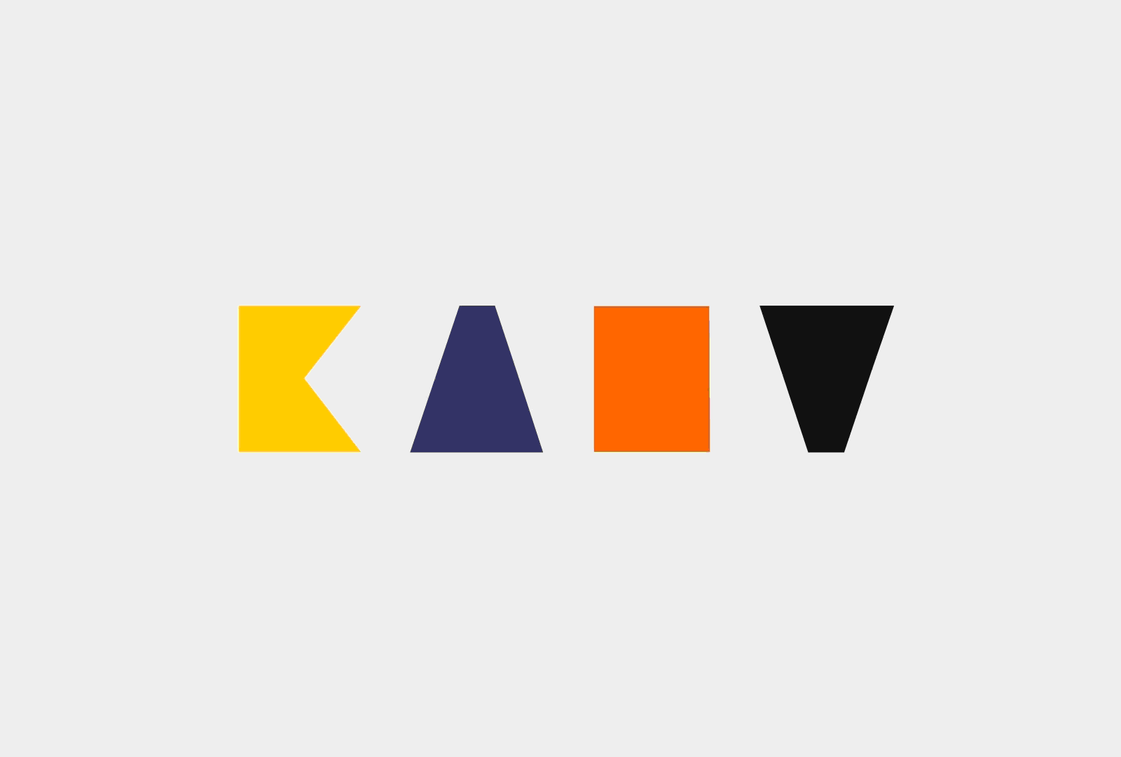
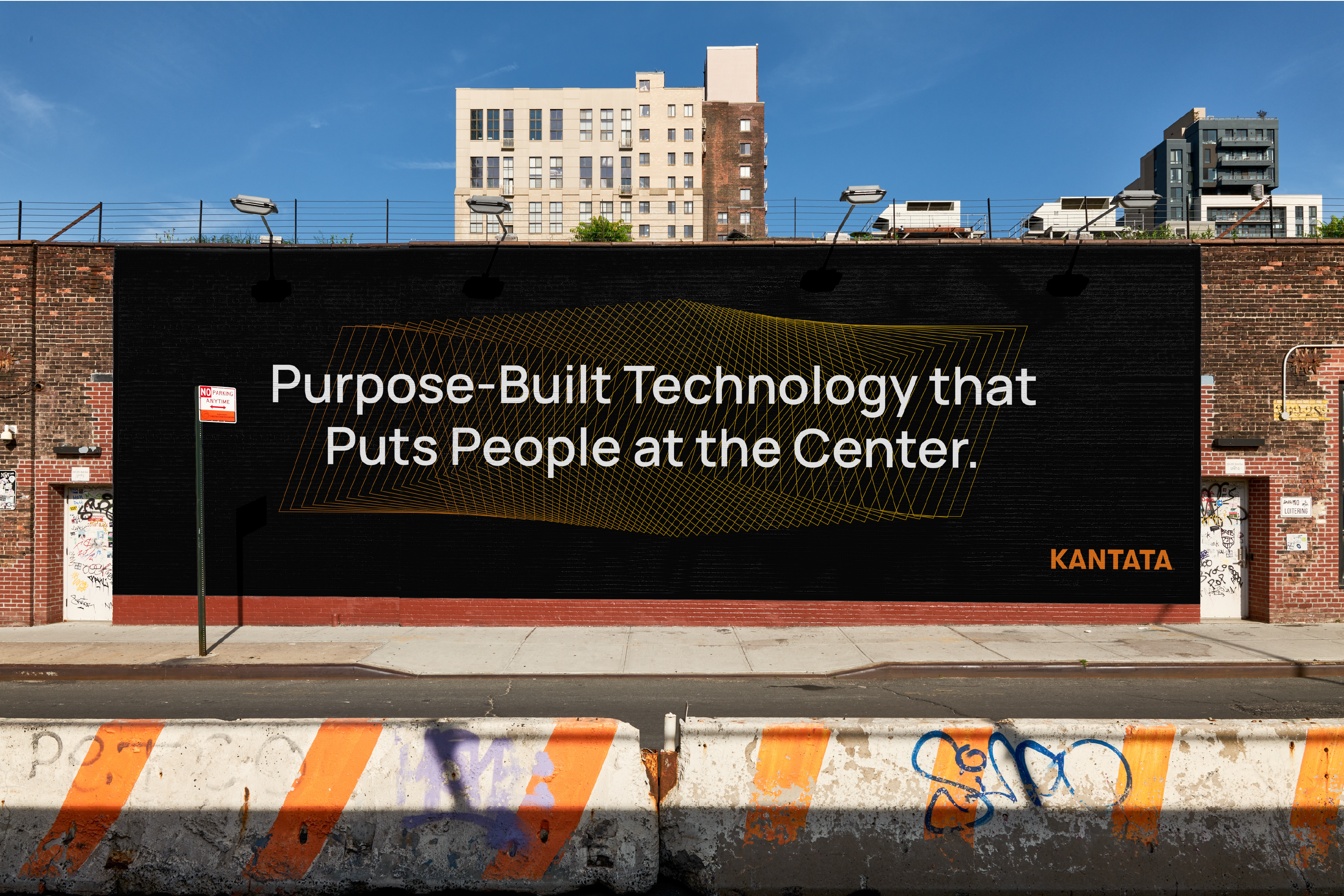
Having recently merge with Kimble to further expand their professional services, they needed a rebrand that consolidated a joint vision with a purposeful, human and charismatic goal. Starting with a new all-caps strong wordmark and name, we took a closer look at the strong geometric shapes from which a set of shapes were developed. These shapes served as the DNA that connected to rest of the design system by communicating the constant trasnformation Kantata’s client face on a daily basis. An expanded color palette allows the brand to speak to different products in a warm and human tone, while the primary orange color reflects technology and confidence.
Having recently merge with Kimble to further expand their professional services, they needed a rebrand that consolidated a joint vision with a purposeful, human and charismatic goal. Starting with a new all-caps strong wordmark and name, we took a closer look at the strong geometric shapes from which a set of shapes were developed. These shapes served as the DNA that connected to rest of the design system by communicating the constant trasnformation Kantata’s client face on a daily basis. An expanded color palette allows the brand to speak to different products in a warm and human tone, while the primary orange color reflects technology and confidence.
A new photography approach captures a more casual personality that reflects the new remote work lifestyles bringing people to the forefront of Kantata’s brand’s expression.
Taken together, the new rebrand celebrates a joint vision of two companies celebrating a transformational journey that focus on technology and the people behind it.
Industry: Software Development
What We Did:
Logo Design, Brand and Art Direction
Taken together, the new rebrand celebrates a joint vision of two companies celebrating a transformational journey that focus on technology and the people behind it.
Industry: Software Development
What We Did:
Logo Design, Brand and Art Direction